
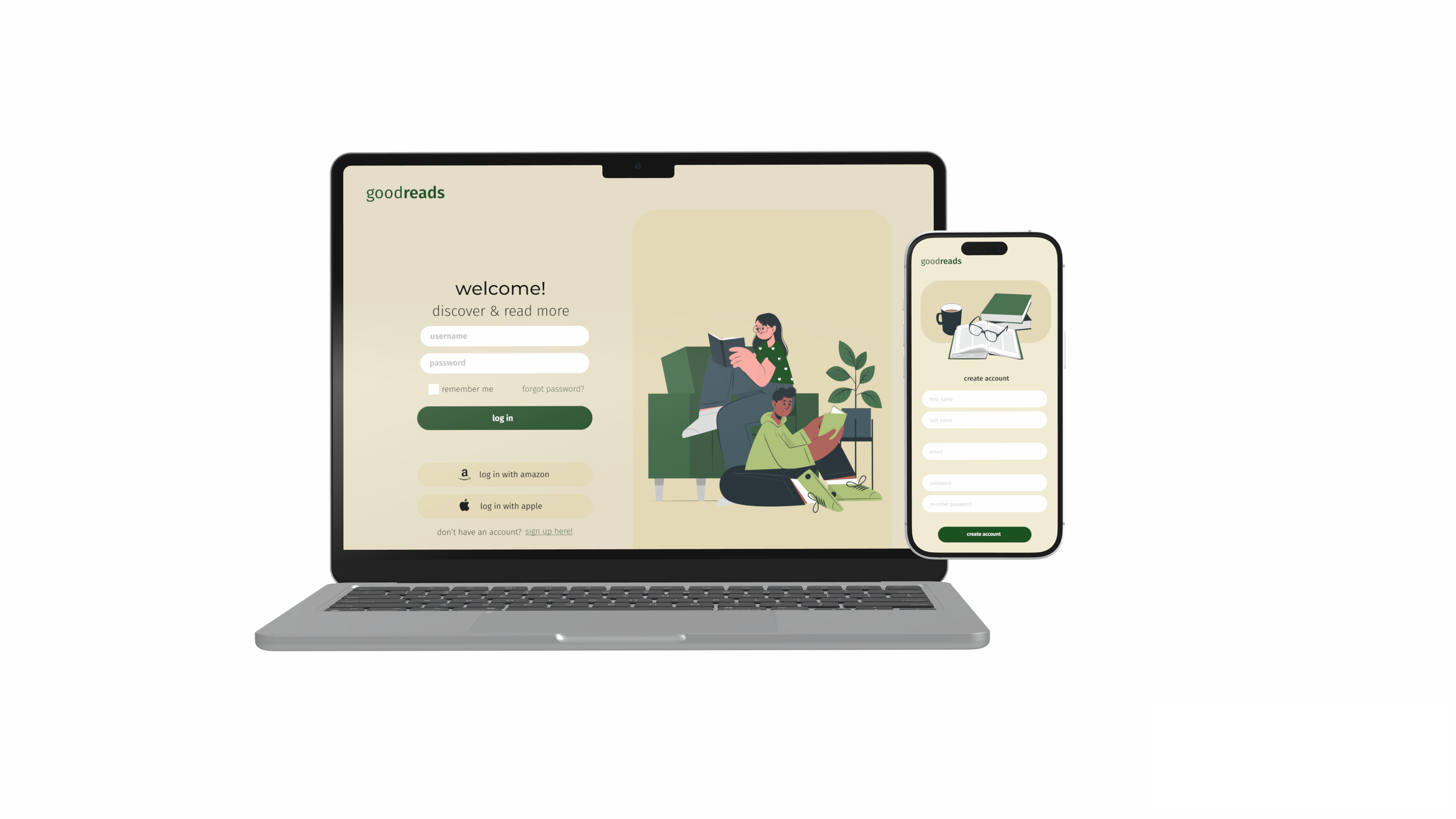
my first design project, where i chose to redesign the app/website, goodreads! as a book lover myself and someone who uses goodreads, i chose to redesign goodreads in order to provide book lovers like me a more seamless, visually-appealing experience.
goodreads is a popular social cataloging platform for book lovers, allowing users to track their reading, write reviews, and discover new books based on recommendations and community interactions. however, despite its widespread usage, many users feel that the website and app are outdated in terms of design and user experience. the goals of this project was to explore how a redesign would improve the platform’s usability, user engagement, and overall appeal, while retaining its core functionality.
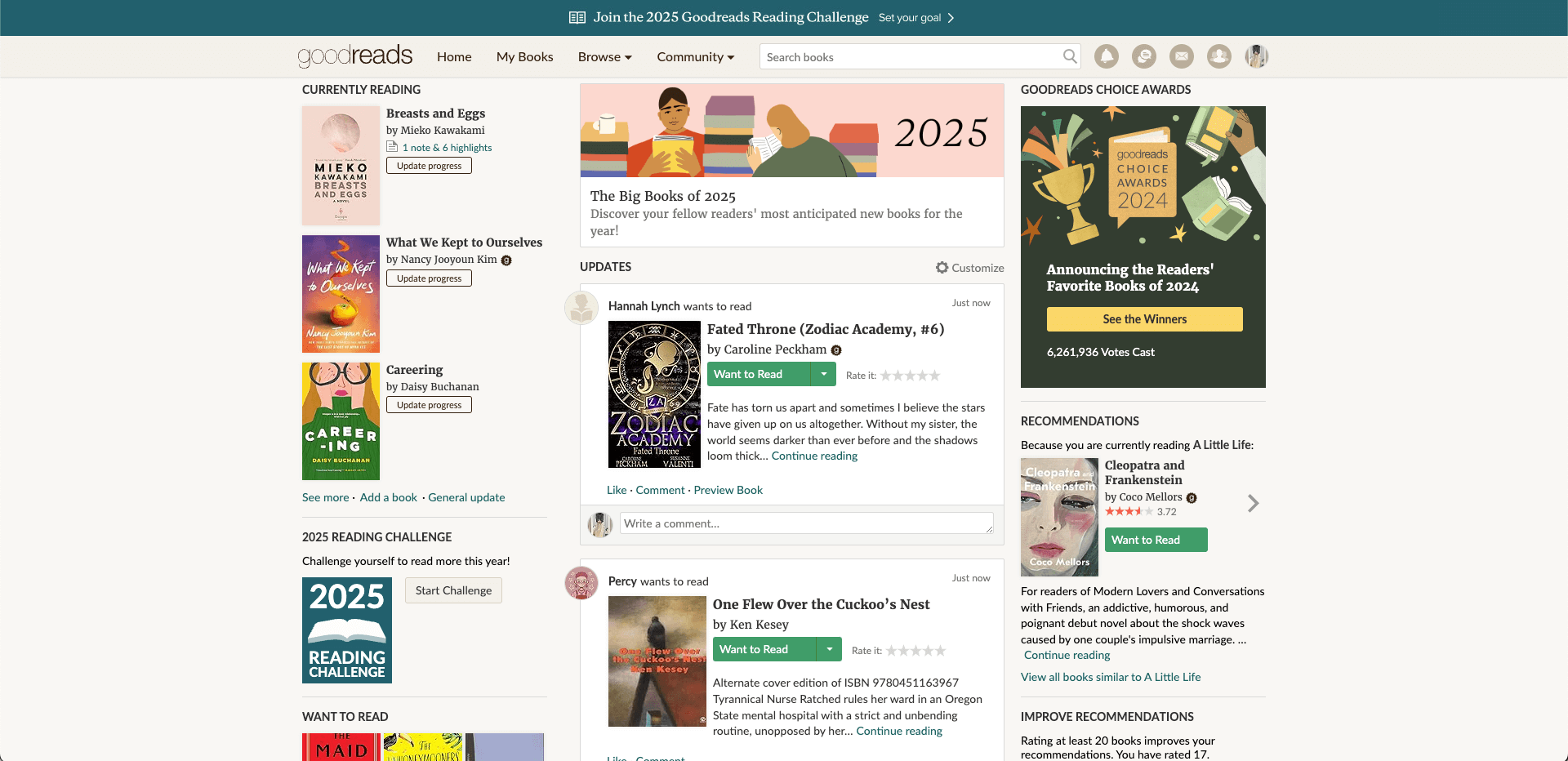
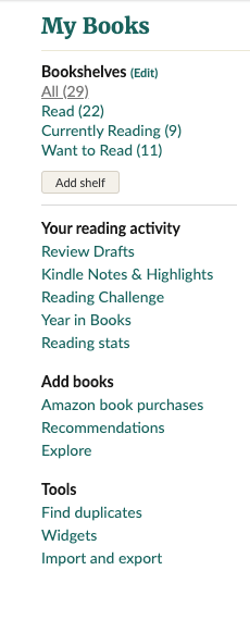
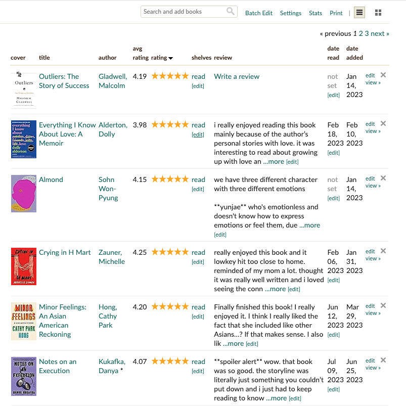
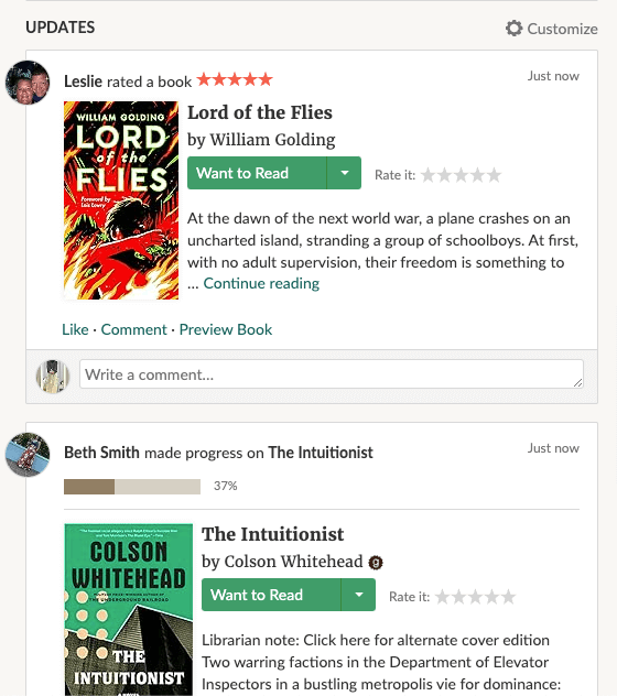
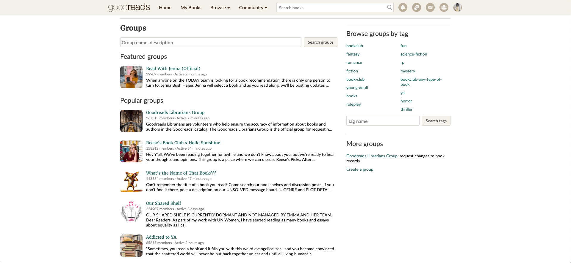
i interviewed two users to better understand the pain points of this website. i knew that there were a lot of problems with the current design, so through these two user interviews, i was able to better understand what certain design aspects had to be fixed!
subject a has never used goodreads before
subject b occasionally uses goodreads
from the two users that i interviewed, i was able to understand what the problems i wanted to focus on fixing. the primary object of the redesign was to modernize the platform, enhance user engagement, and improve the user experience across both web and mobile, and that is what i wanted to achieve when it came to my final design.


these two low-fidelity wireframes for a goodreads mobile app aim to enhance the user experience by focusing on book discovery, reading progress tracking, engagement, and navigation efficiency. they prioritize a structured layout that helps users seamlessly browse, organize, and interact with books. both designs are structured to improve the user experience in discovering, tracking, and engaging with books. the first wireframe (left) emphasizes book discovery through categories and progress tracking, while the second one (right) focuses more on engagement through carousels and detailed book descriptions.
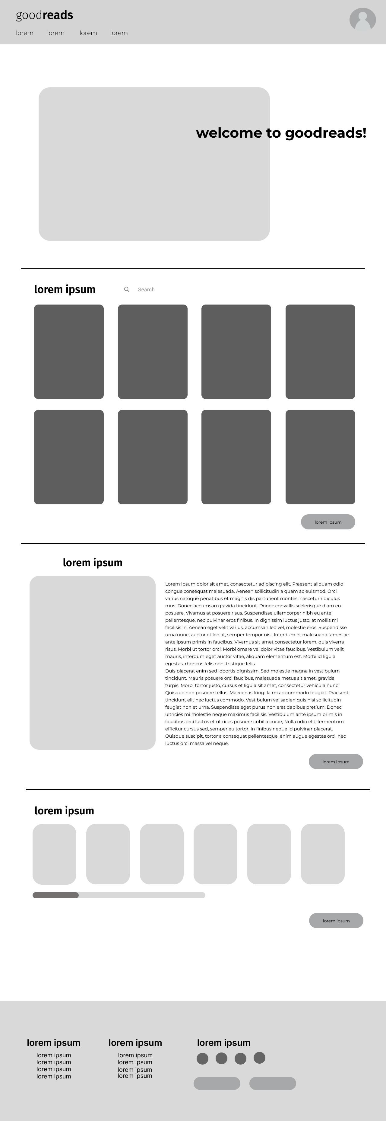

like the low-fidelity mobile wireframes, these desktop wireframes enhances usability, engagement, and discoverability by modernizing the interface while maintaining the platform's core functionality. with a simplified navigation and layout, users can easily find what they're looking for and have a better understanding of the platform's features and capabilities. the first wireframe (left) makes it easier for users to engage with goodreads' core functions which are to discover books, interact with the community, and maange their reading lists. the second one (right) makes the book details page more informative, engaging, and action-driven, encouraging users to interact with reviews, discussions, and book recommendations effortlessly.
from the low-fidelity wireframes and the user feedback, i was able to complete this final redesign of goodreads!
click here to see my final prototype!users benefit from a cleaner interface, faster and more intuitive navigation, and enhanced book discovery features, making goodreads a more enjoyable platform for tracking reading and engaging with a like-minded community, while providing a more enjoyable experienced with enhanced book discovery and community features
being the first design project i have ever worked on, this was a great learning process for me. i learned the importance of aligning design decisions with both user needs and business goals, teaching me to appreciate the value of design, continuous feedback, and effective communication. i learned to understand why design is so important, and that all because it looks pretty, it's not the most user-friendly.